Enforcement
Care Quality Commision (CQC)
The beginning…
Overview
Problem
Challenge
- Identify optimisations for the current Canvas app through user research and industry insights.
- Streamline user journeys by analyzing and refining workflows.
- Enable users to upload and tag multiple files or evidence simultaneously.
- Minimize clicks required for completing key tasks.
- Update the UI for clearer interactions and easier data interpretation.
- Improve accessibility and compatibility with assistive technologies.
- Enhance the toolset for Ops Managers during the assurance stage.
The middle…
#1 Streamlining Gather and Assess
Problem
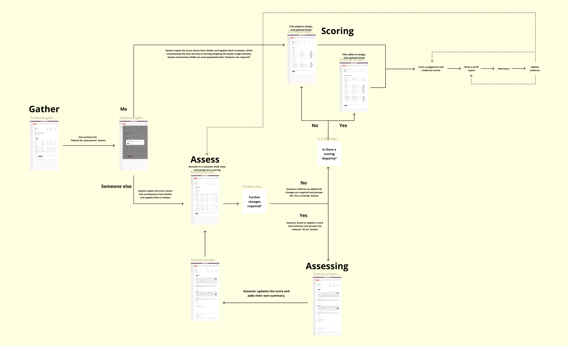
The original design for the Gather and Assess stages assumed separate roles for Inspectors and Assessors. In practice, however, most Inspectors were also responsible for the Assessing role, leading to unnecessary duplication of work. Users faced repeated requests for the same information, wasting time and causing frustration with excessive clicks and redundant processes.
Solution
I designed a streamlined process to eliminate this duplication. After completing the Gather stage, users are prompted with a simple question: “Will you also be completing the Assess stage?”
- If ME: The system bypasses the Assess stage, automatically populating assessment data fields and saving time.
- If SOMEONE ELSE: The system progresses to the Assess stage, notifying the assigned Assessor that action is required.
Feedback
This update significantly reduced repetition, saving users time and effort while improving efficiency. The solution received overwhelmingly positive feedback from both users and the business, with benefits including:
- Improved productivity, enabling faster completion of assessments.
- Enhanced user satisfaction and reduced frustration, positively impacting mental health.
A small but impactful change that made a big difference!
#2 Enhancing the Assurance stage
Problem
Participants highlighted several key challenges with the platform:
- Difficulty reviewing draft reports due to unreadable text blocks, lack of a full report view, and tedious searches for specific references.
- Frustrations with editing and feedback, including format changes, unclear content alignment, and excessive word limits for comments.
- Confusing navigation, with unclear workflows and premature actions caused by misplaced buttons.
- Excessive clicking leading to physical strain for inspectors.
- Insufficient and inconsistent guidance, leaving users uncertain and reliant on workarounds like Word documents and emails.
- Requests for better guidance, tooltips, and standardized tools to improve usability and reduce repetitive efforts.
Solution
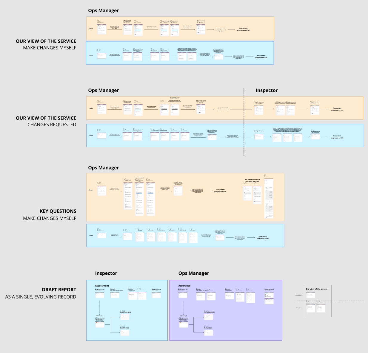
- Created a new draft report layout, allowing users to jump directly to specific sections, compare key parts, and view more content on a single page, improving consistency and contextual understanding.
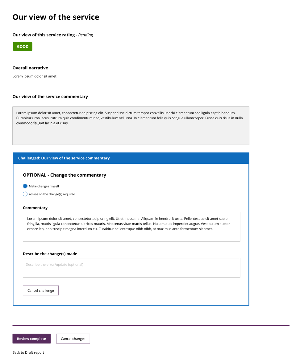
- Designed a toolset for Ops Managers to make small changes instantly, reducing time waste and speeding up the assessment process.
- Redesigned buttons with clearer calls to action and consistent colours to guide users and improve navigation.
- Added subtle on-screen guidance to keep users focused and provide helpful prompts without interrupting their workflow.
- Streamlined navigation and task completion, enabling faster and more efficient use of the assessment plan and draft report.
Feedback
- Ops managers appreciated the ability to make small changes themselves, avoiding the lengthy process of describing and sending requests back to inspectors.
- Both inspectors and ops managers found the new tracking tools invaluable for monitoring whether recommended changes had been implemented.
- The improved scoring and commentary comparison screen was praised for its clarity and for making the reasoning behind scoring decisions easier to understand.
- All users valued the new evidence tab, which provided a single, centralized location to view all evidence uploaded to the assessment plan.
#3 Multi-file multi-tagging
Problem
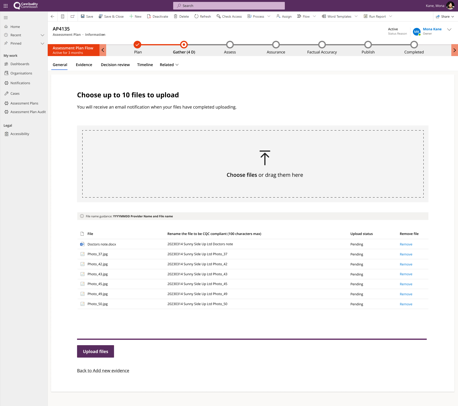
The original design only allowed users to upload one file at a time, and as the performance of the canvas app was extremely slow, this could result in extremely long upload times; minutes to hours for even the simplest of files. Additional time would then be spent trying to successfully tag the evidence with the correct evidence category.
Solution
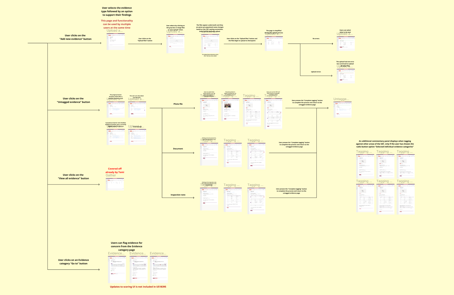
- Adapted one of my existing Enforcement enhancements, to meet the needs of Inspectors and Assessors.
- Enabled users to drag and drop up to 10 files into a file uploader, with automatic renaming based on CQC naming conventions.
- Added features for users to review, edit, and confirm file names before upload.
- Introduced notifications for upload completion, either via email or on-screen, with clear calls to action.
- Provided a dedicated “waiting to be tagged” page, allowing users to preview, multi-tag files across all evidence categories, or tag manually for greater flexibility.
Feedback
- Multi-Tagging Made Simple: Users were highly impressed by the ability to tag evidence across multiple categories on a single page, significantly speeding up their workflow.
- Dedicated Evidence Details Page: The introduction of this page received overwhelmingly positive feedback, with comments like, “We’ve been asking for this forever” and “This would be so great.” Users highlighted its importance in allowing them to easily add or remove categories for specific evidence.
- Dedicated Evidence Details Page: The introduction of this page received overwhelmingly positive feedback, with comments like, “We’ve been asking for this forever” and “This would be so great.” Users highlighted its importance in allowing them to easily add or remove categories for specific evidence.
- Optional Commentary Feature: Participants appreciated the flexibility to add comments for each evidence category, calling it a “great addition” that improves clarity and context.
These updates were praised for streamlining processes, improving usability, and addressing long-standing user needs.
And the end…
Increased efficiency and productivity by streamlining processes
Enhanced usability, transparency and insights
Higher user satisfaction by addressing long standing needs
The work delivered brought transformative improvements that streamlined workflows, reduced inefficiencies, and enhanced usability across critical processes. By minimizing repetitive tasks, enabling faster assessments, and providing intuitive tools, the updates significantly boosted productivity and user satisfaction.
Key enhancements, such as centralized evidence management, improved scoring transparency, and multi-tagging capabilities, addressed long-standing user needs while fostering greater clarity and control. The overwhelmingly positive feedback from users and stakeholders highlights the success of these changes in delivering meaningful, lasting benefits that simplified operations and elevated the overall experience.
Previous case study
Rebrand – Rehab Physio London
Next case study
Enforcement – Care Quality Commission (CQC)

