Transforming Breast Screening Data into Interactive National Dashboards
#AI#Data Engineering#UX#Interaction Design#Healthcare

Highlights
- Prototyped data-driven dashboards in Palantir Foundry FDP
- Unified national, regional, and local datasets into one interactive environment
- Solved complex mapping and data-modelling challenges
- Iteratively scaled prototypes (10k → 100k → 1M rows) to test performance
- Validated FDP as a sustainable analytics platform for NHS screening
Millions of records unified in a scalable data model
Proof of concept for national screening dashboards in FDP
Rapid prototyping from dataset to dashboard
The Challenge
The NHS Breast Screening Programme serves millions of women each year, but its reporting systems were fragmented and slow.
Teams across national, regional, and local levels needed shared access to consistent data — yet tools, formats, and granularity varied widely.
Static reporting
Existing outputs were fixed and non-interactive, limiting exploration and self-serve insight.
Fragmented data
Regional and local datasets weren’t aligned, making it hard to compare or aggregate performance.
Performance lag
New platform, new rules
Breast screening had never used Palantir FDP, requiring discovery through hands-on exploration.
Design Approach
Breaking down the key design decisions that shaped a clear, scalable reporting experience.
Learning by doing

Building reliable, AI-enriched test data

Overcoming technical barriers
Several early hurdles shaped the engineering side of the work:
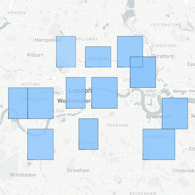
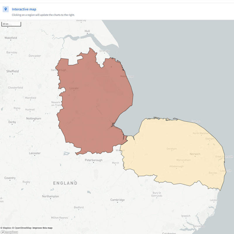
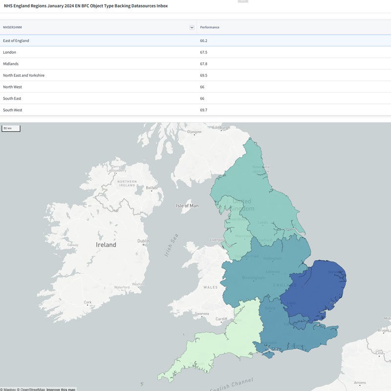
- Maps & choropleths: Debugged rendering issues by creating a custom dataset and testing with a “blue box” overlay to confirm the layer logic.
- Dynamic visibility: Used variable logic to show or hide content dynamically based on user selections.
- Design standards: Recreated GOV.UK patterns inside Workshop to ensure familiarity and accessibility.
Designing for real people
- Local BSOs → operational performance and day-to-day metrics.
- National commissioners → strategic trends and regional comparisons.

Iterating to scale
- From simple tables → expandable participant records.
- From static lines → interactive, quarter-by-quarter visuals.
- From isolated datasets → a unified user journey.
By iterating, testing, and scaling, an unfamiliar platform evolved into a robust, flexible tool fit for national deployment.
Key insight: Iteration wasn’t just refinement — it was the engine that turned experimentation into a scalable, production-ready design.

Outcomes
Delivering working prototypes early built platform confidence — transforming an experiment into a validated foundation for future NHS dashboards.
Real-time insights
Unified data model
Proof of concept
What changed
- Unified data experience: Static reports became fully interactive dashboards.
- Dual-level visibility: BSOs and commissioners now access insights from the same system.
- Scalable architecture: Proven FDP model for future NHS screening tools.
- Familiar design language: GOV.UK-aligned UI improved accessibility and trust.
Reflections
The project highlighted how design can act as a bridge between users and technical platforms, shaping not just interfaces but strategic decisions.
Key learnings
- Early prototyping uncovers both UX and data-model constraints.
- Hands-on iteration builds credibility with technical and user stakeholders alike.
- Bridging design and engineering accelerates delivery of scalable insights.